Hack4Impact (H4I) is a 501(c)(3) organization that provides free software solutions for local nonprofits in San Luis Obispo.
In 2022, we at H4I teamed up with a nonprofit called Partners in Equestrian Therapy (P.E.T.), an equine therapy group who were suffering from inefficient shift scheduling.
Before our partnership, admins were communicating one-on-one with volunteers and riders over text and scheduling shifts in Google Calendar manually.
This meant that if a shift or session was canceled or needed to be modified, the admins would have to do that manually as well.
- Melanie Williams-Mahan, admin
What features in the web app would help solve problems related to scheduling shifts?
How would those features differ based on account type?
What is your level of expertise with platforms like the one we're talking about building?
Using what we'd learned, we made a Product Requirements Document outlining all of the tasks our web app would need to handle.
After reviewing it with the admins, came to the collective conclusion that some kind of calendar with different account types for admins, volunteers, and riders would work best.
We also learned that the admins didn't have very technical backgrounds or in some cases didn't have much experience with technology at all, so we realized that simplicity was going to be paramount.
Next, the other designer and I put together an updated user flowchart to help guide us through the design process for each account type.
COMPETITIVE ANALYSIS 🏀
Since we knew the calendar was going to be a major part of the web app, we scoured Pinterest and Google images for the best calendar UIs, paying attention to the layout, navigation, and affordances of each.
The primary focus of our competitive analysis was to determine if the default view of the calendar should be daily, weekly, or monthly, and if admins should be able to switch between views.
We determined that a weekly view would be optimal for our web app because it could show upcoming events with the time on the slot still visible. For simplicity's sake, we decided to keep the view static.
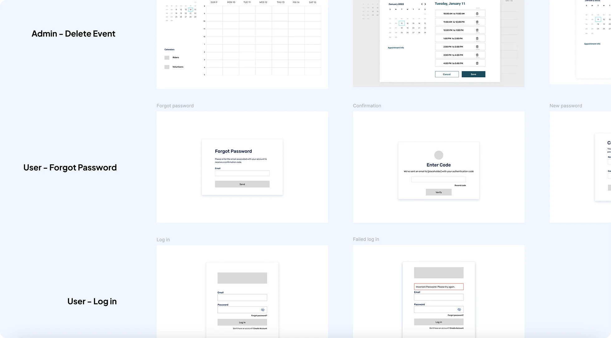
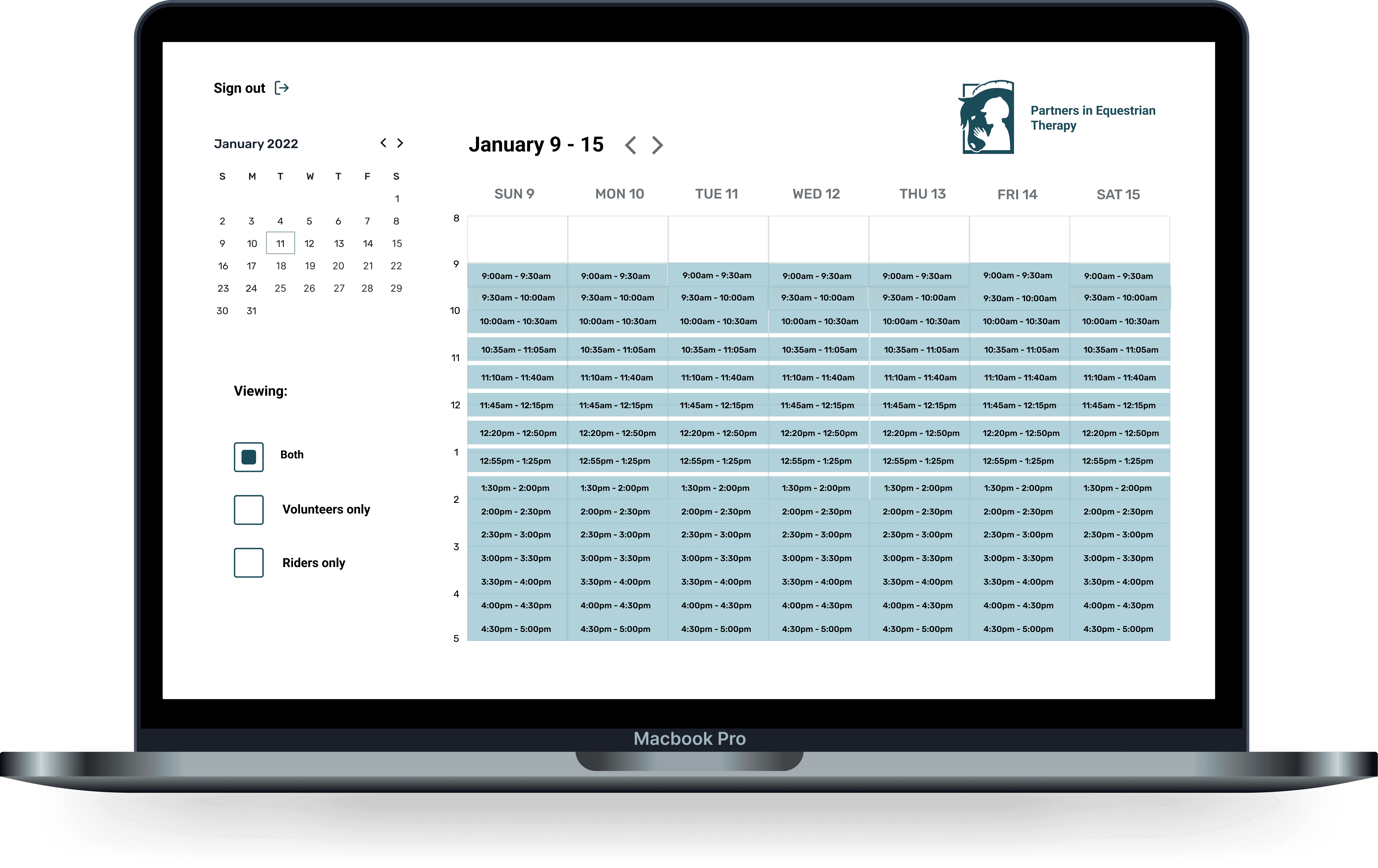
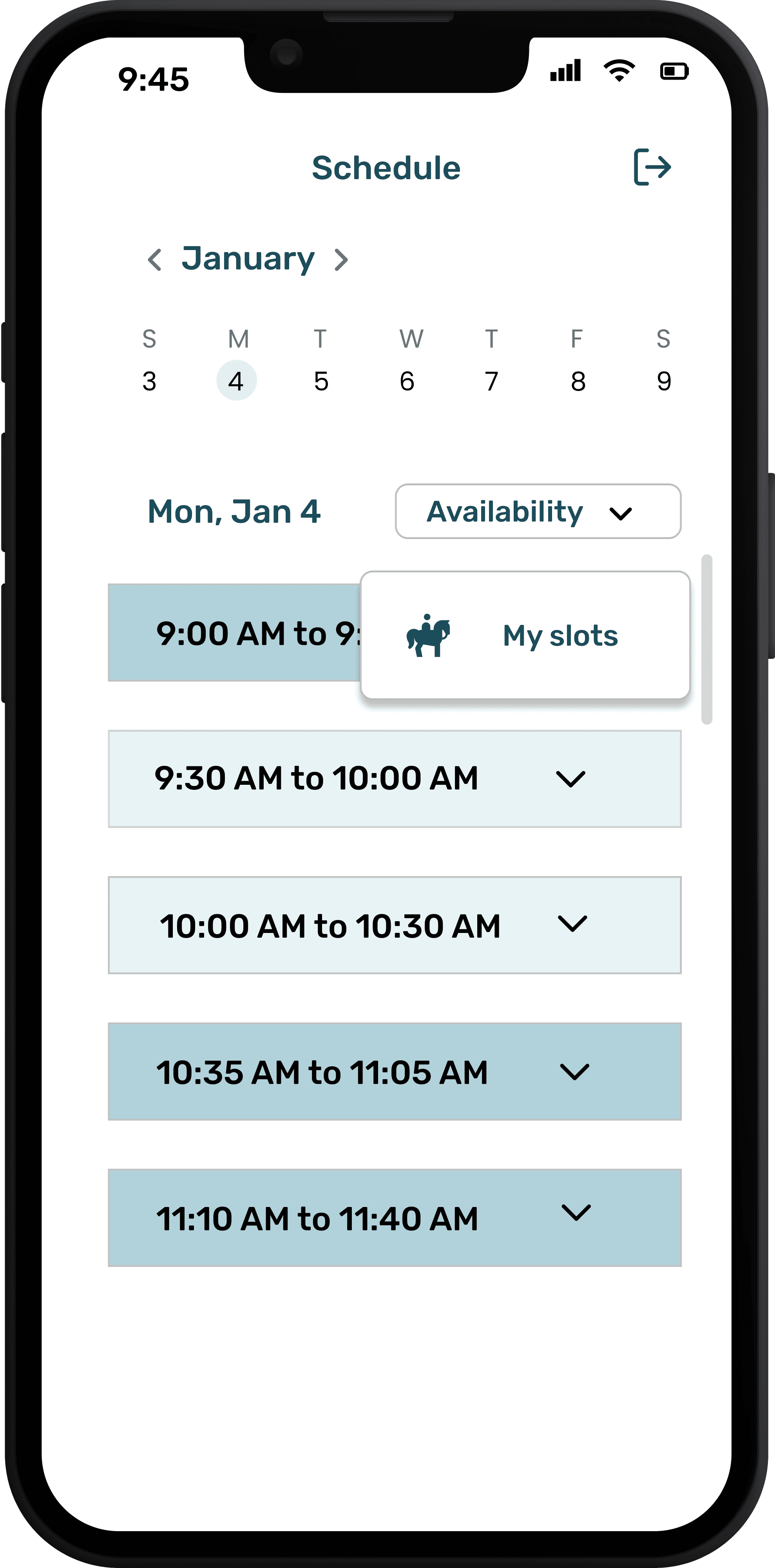
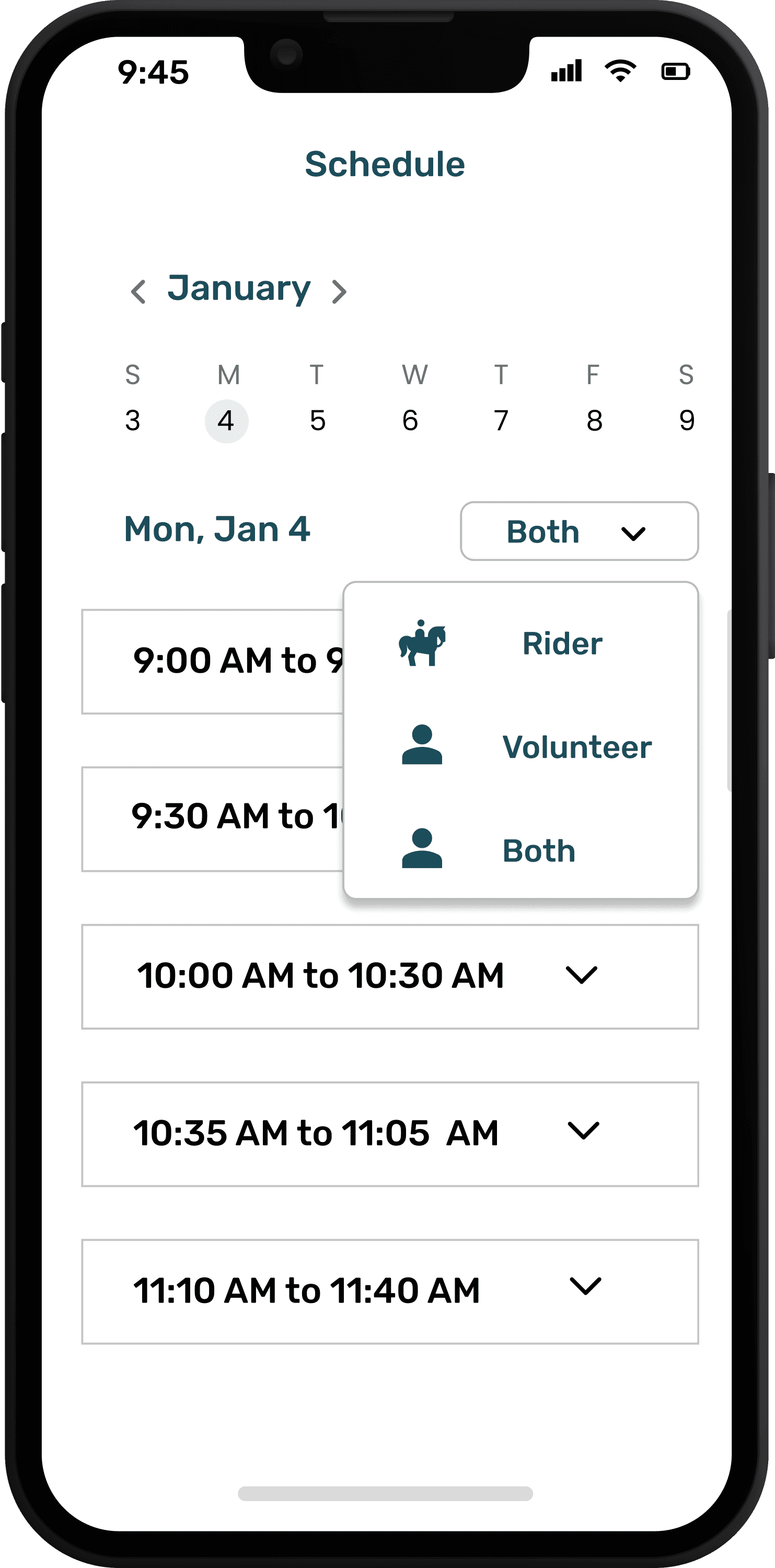
As we began wireframing, the first issue we tackled was the different account types and being able to see the time slots for each type. On the admin view of the calendar, we added options for volunteer, rider, and both, to allow the admin to toggle between them.
The next requirement we wanted to address was being able to delete time slots.
Our initial idea was to allow admins to "trash" slots and add them back, but their non-technical background was a bit worrisome and we were concerned that they might struggle to add a slot back if it was deleted accidentally.
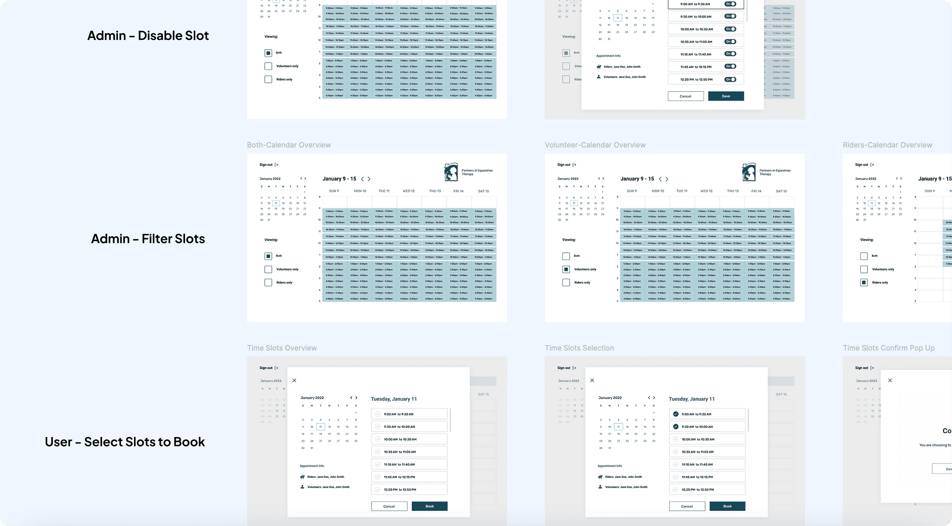
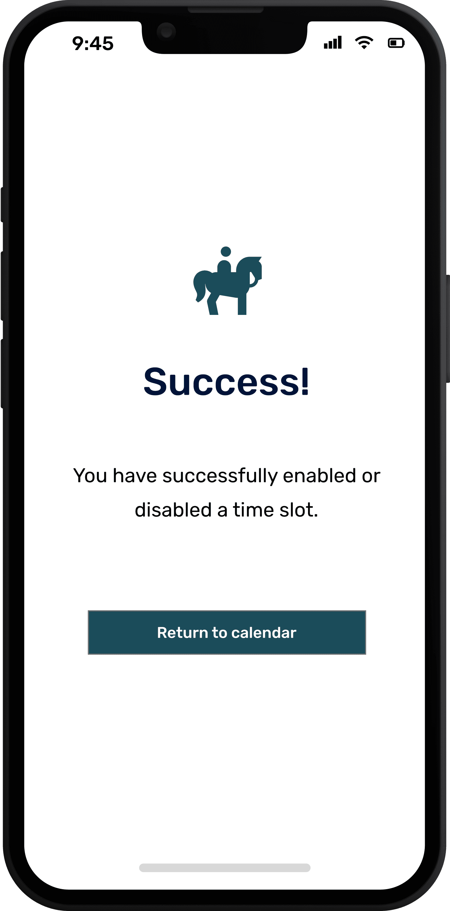
Our final iteration of the time slots popup featured toggles to disable or enable a slot. This version minimized the risk of an admin cancelling a time slot accidentally and reduced number of clicks to add it back.
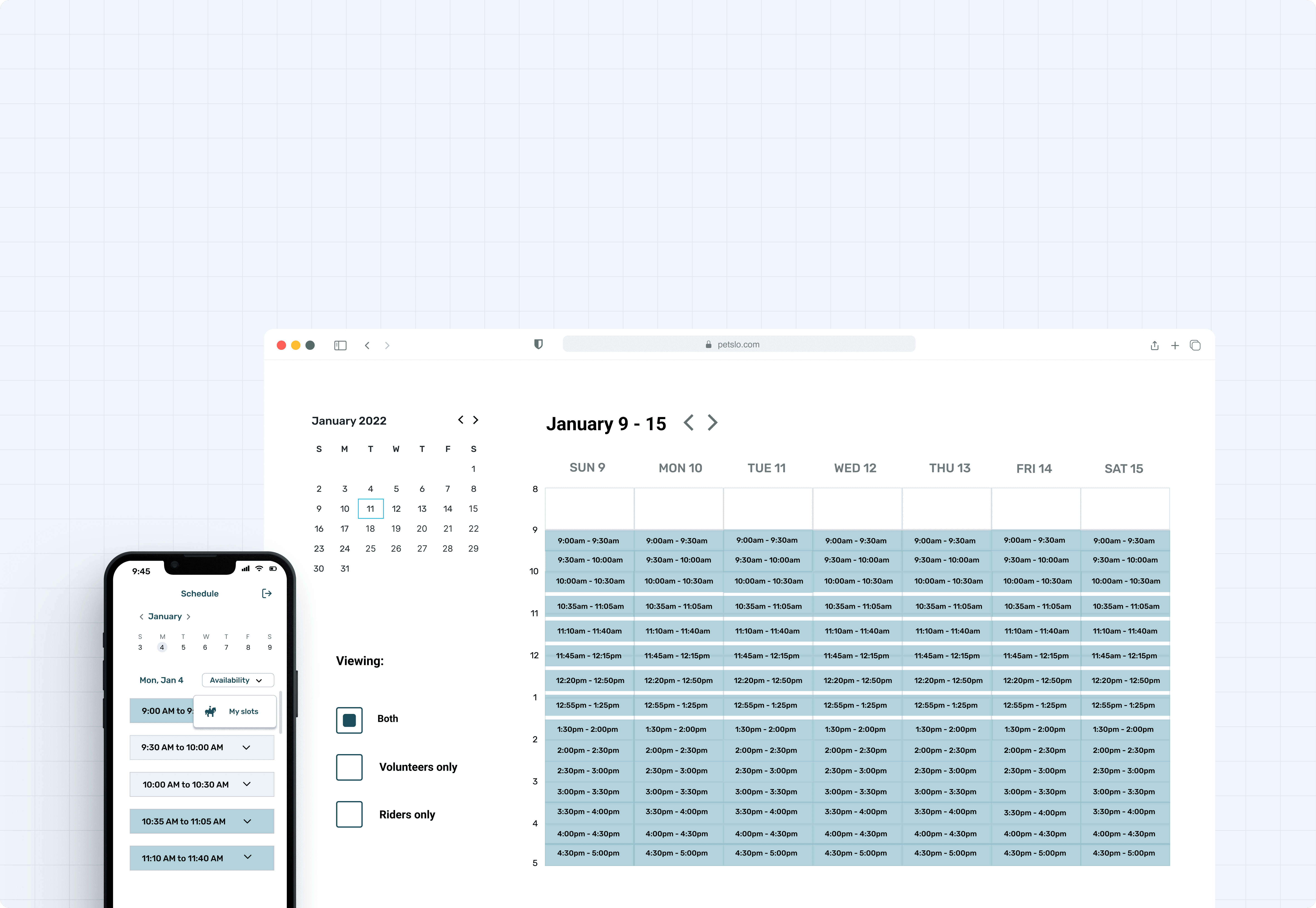
We also quickly realized that time slots would have different states, including a default state for unaffected slots, (aqua), a full state for slots where the maximum number of users had already signed up, (light aqua), and disabled for slots that had to be canceled due to weather, holidays, etc. (missing for user and volunteers, gray for admins).
USABILITY TESTING 🔬
We conducted a round of usability testing using our Figma prototype where we asked two admins to do four key tasks: filtering visibility on the calendar, viewing the time slots popup, disabling a time slot, and signing out.
As they clicked through, we asked them to verbalize their thoughts and let us know if they were having any trouble. As we took notes, we were happy to learn that they only had a few clarifying questions and overwhelming positive feedback.
At one point, one of the admins who didn't have as much experience with technology actually called the web app "user-friendly," which we interpreted as a good sign that we had met their accessibility needs.
We realized post-handoff that admins should probably be able to remove a user from a time slot, such as in the case that they became sick and couldn't come to their appointment anymore but forgot to cancel it.
The colors of the states for the time slots are probably too similar and therefore not accessibility compliant. We used shades of their logo color to keep the design consistent with their branding, but that choice probably wasn't very considerate of visually impaired users.
That's it from me. Here's some more helpful links: